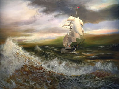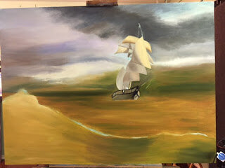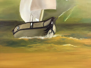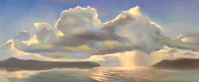

Every time I paint a new marine painting, I'm reminded of why these can be so difficult to do well. Although I had the background for this piece worked out, finding the right resource for the water and the sailboat became a great challenge. I needed to find one where the waves, water, wind and light all worked with the reference photo of the clouds. Basically, I needed three photos. Actually, that's not as many as I used for my large marine piece, "Before the Reef". But still, even with finding photos that worked for all those factors, I was still confronted with the color issue. How to make all these disparate factors come together for a harmonious painting.
I find in these cases the best thing to do is to put it all together on Photoshop, work on getting the light and values to work together and then changing the whole image to black and white. Then I can use what ever colors work best for the piece without being influenced by what I see in a photo. That's what I did here. I may change things a bit later on. I sometimes do. But I think it's OK for now. Anyway, it needs to go in my upcoming show at Gallery 9 in December. Wish me luck.
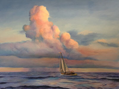
"Running with the Wind"
17 1/2" x 23 1/2"
Oil on Panel
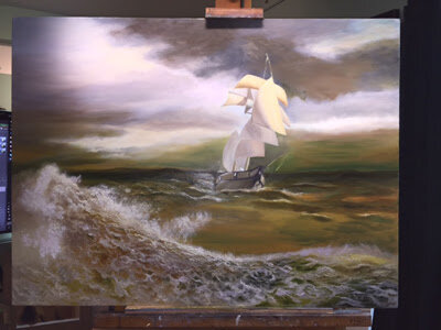
I find in these cases the best thing to do is to put it all together on Photoshop, work on getting the light and values to work together and then changing the whole image to black and white. Then I can use what ever colors work best for the piece without being influenced by what I see in a photo. That's what I did here. I may change things a bit later on. I sometimes do. But I think it's OK for now. Anyway, it needs to go in my upcoming show at Gallery 9 in December. Wish me luck.
"Running with the Wind"
17 1/2" x 23 1/2"
Oil on Panel